Circle
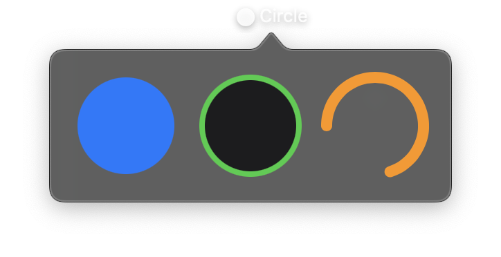
A circular shape centered in its frame. Circle always maintains a 1:1 aspect ratio, filling the smaller dimension of its frame.
Circle supports trim properties for drawing partial arcs, making it useful for progress rings and arc indicators. Values for trim_from and trim_to range from 0.0 to 1.0, where 0.0 is the 3 o'clock position and 1.0 is a full circle. Use rotation to change the starting position (for example, -90 to start from the top).
Constructor
nib.Circle(
    fill=None,
    stroke_color=None,
    stroke_width=None,
    trim_from=None,
    trim_to=None,
    rotation=None,
    **modifiers,
)
Parameters
| Parameter | Type | Default | Description |
|---|---|---|---|
fill |
str | Color |
None |
Fill color for the circle interior. Accepts hex strings, named colors, or Color instances. |
stroke_color |
str | Color |
None |
Outline colour, drawn along the circle's edge. |
stroke_width |
float |
None |
Width of the stroke in points. |
trim_from |
float |
None |
Fractional starting point (0.0 to 1.0) for partial circle arcs. |
trim_to |
float |
None |
Fractional ending point (0.0 to 1.0) for partial circle arcs. |
rotation |
float |
None |
Rotation angle in degrees. Use -90 to start trimmed circles from the top instead of the right. |
**modifiers |
Common view modifiers: width, height, padding, opacity, animation, etc. |
Examples
Basic circles
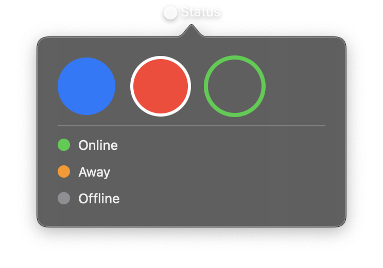
import nib


def main(app: nib.App):
    app.title = "Status"
    app.icon = nib.SFSymbol("circle.fill")
    app.height = 240

    def dot(color, name):
        return nib.HStack(
            controls=[nib.Circle(fill=color, width=12, height=12), nib.Text(name)],
            spacing=8,
        )

    app.build(
        nib.VStack(
            controls=[
                nib.HStack(
                    controls=[
                        nib.Circle(fill=nib.Color.BLUE, width=56, height=56),
                        nib.Circle(
                            fill=nib.Color.RED,
                            stroke_color=nib.Color.WHITE,
                            stroke_width=3,
                            width=56,
                            height=56,
                        ),
                        nib.Circle(
                            stroke_color=nib.Color.GREEN,
                            stroke_width=4,
                            width=56,
                            height=56,
                        ),
                    ],
                    spacing=16,
                ),
                nib.Divider(),
                dot(nib.Color.GREEN, "Online"),
                dot(nib.Color.ORANGE, "Away"),
                dot(nib.Color.GRAY, "Offline"),
            ],
            spacing=10,
            padding=20,
            alignment=nib.Alignment.LEADING,
        )
    )


nib.run(main)
Progress ring
Use trim_from and trim_to to create a progress indicator. Set rotation=-90 to start from the top.
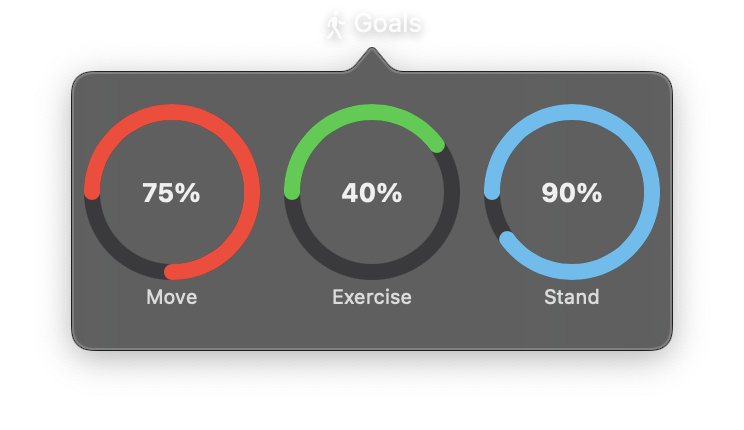
import nib


def main(app: nib.App):
    app.title = "Goals"
    app.icon = nib.SFSymbol("figure.walk")

    def ring(name, progress, color):
        return nib.VStack(
            controls=[
                nib.ZStack(
                    controls=[
                        nib.Circle(
                            stroke_color="#3a3a3c", stroke_width=8, width=80, height=80
                        ),
                        nib.Circle(
                            stroke_color=color,
                            stroke_width=8,
                            trim_from=0.0,
                            trim_to=progress,
                            rotation=-90,
                            width=80,
                            height=80,
                        ),
                        nib.Text(f"{int(progress * 100)}%", font=nib.Font.HEADLINE),
                    ]
                ),
                nib.Text(
                    name, font=nib.Font.CAPTION, foreground_color=nib.Color.SECONDARY
                ),
            ],
            spacing=6,
        )

    app.build(
        nib.HStack(
            controls=[
                ring("Move", 0.75, nib.Color.RED),
                ring("Exercise", 0.4, nib.Color.GREEN),
                ring("Stand", 0.9, nib.Color.CYAN),
            ],
            spacing=20,
            padding=20,
        )
    )


nib.run(main)