Button
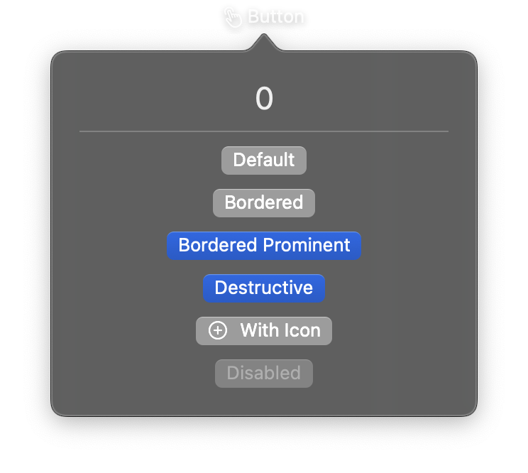
A control that initiates an action when tapped. Buttons can display a text label, an SF Symbol icon, or fully custom content views. Various styles and semantic roles can be applied to communicate the button's purpose.
Constructor
nib.Button(
    label=None,
    icon=None,
    action=None,
    content=None,
    style=None,
    role=None,
    border_shape=None,
    control_size=None,
    label_style=None,
    tint=None,
    disabled=False,
    **modifiers,
)
Parameters
| Parameter | Type | Default | Description |
|---|---|---|---|
label |
str |
None |
Text displayed on the button. |
icon |
str |
None |
SF Symbol name for the button icon (e.g., "gear", "trash", "star.fill"). Can be combined with label. |
action |
Callable |
None |
Callback function executed when the button is tapped. Should accept no arguments. |
content |
View |
None |
Custom view to use as button content. Alternative to label/icon. |
style |
ButtonStyle | str |
None |
Visual style. Options: ButtonStyle.automatic, ButtonStyle.bordered, ButtonStyle.borderedProminent, ButtonStyle.borderless, ButtonStyle.plain. |
role |
ButtonRole | str |
None |
Semantic role affecting appearance. Options: ButtonRole.destructive (red tint), ButtonRole.cancel. |
border_shape |
BorderShape | str |
None |
Shape of the button border. Options: BorderShape.automatic, BorderShape.capsule, BorderShape.roundedRectangle. |
control_size |
ControlSize | str |
None |
Size of the control. Options: ControlSize.mini, ControlSize.small, ControlSize.regular, ControlSize.large. |
label_style |
LabelStyle | str |
None |
Style for the label content. Options: LabelStyle.automatic, LabelStyle.titleOnly, LabelStyle.iconOnly, LabelStyle.titleAndIcon. |
tint |
Color | str |
None |
Tint color for the button. Accepts a Color enum, hex string, or RGB tuple. |
disabled |
bool |
False |
Whether the button is disabled and non-interactive. |
**modifiers |
Common view modifiers: padding, background, foreground_color, opacity, corner_radius, etc. |
Examples
Simple text button
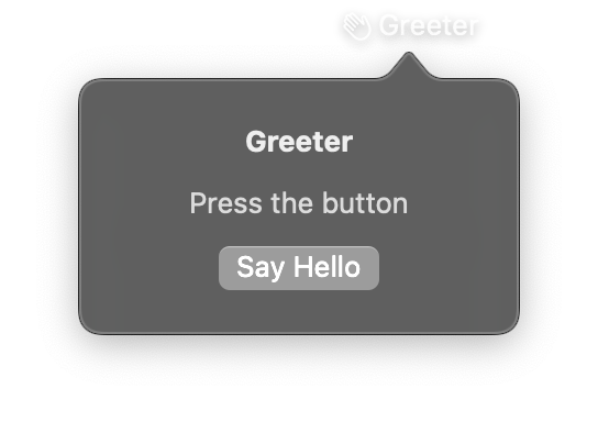
import nib


def main(app: nib.App):
    app.title = "Greeter"
    app.icon = nib.SFSymbol("hand.wave")

    greeting = nib.Text("Press the button", foreground_color=nib.Color.SECONDARY)

    def greet():
        greeting.content = "Hello there!"

    app.build(
        nib.VStack(
            controls=[
                nib.Text("Greeter", font=nib.Font.HEADLINE),
                greeting,
                nib.Button("Say Hello", action=greet),
            ],
            spacing=12,
            padding=20,
        )
    )


nib.run(main)
Styled buttons with roles
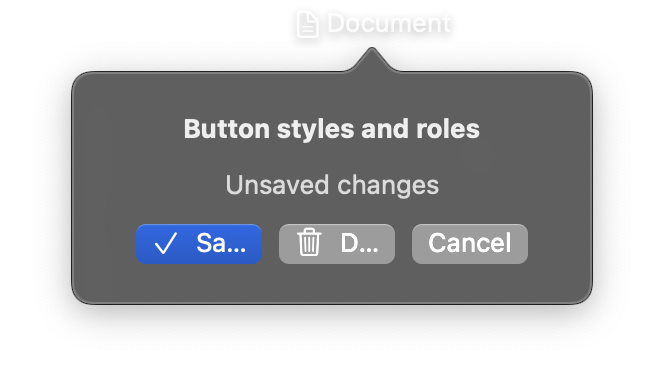
import nib


def main(app: nib.App):
    app.title = "Document"
    app.icon = nib.SFSymbol("doc.text")

    status = nib.Text("Unsaved changes", foreground_color=nib.Color.SECONDARY)

    def set_status(text):
        return lambda: setattr(status, "content", text)

    app.build(
        nib.VStack(
            controls=[
                nib.Text("Button styles and roles", font=nib.Font.HEADLINE),
                status,
                nib.HStack(
                    controls=[
                        nib.Button(
                            "Save",
                            icon="checkmark",
                            action=set_status("Saved"),
                            style=nib.ButtonStyle.BORDERED_PROMINENT,
                        ),
                        nib.Button(
                            "Delete",
                            icon="trash",
                            action=set_status("Deleted"),
                            role=nib.ButtonRole.DESTRUCTIVE,
                            style=nib.ButtonStyle.BORDERED,
                        ),
                        nib.Button(
                            "Cancel",
                            action=set_status("Cancelled"),
                            role=nib.ButtonRole.CANCEL,
                        ),
                    ],
                    spacing=8,
                ),
            ],
            spacing=12,
            padding=20,
        )
    )


nib.run(main)
Related
- Views and Events
- Style Enums:
ButtonStyle,ButtonRole,ControlSize - Link
- ShareLink
- Toggle