Divider
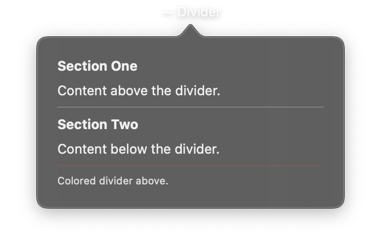
A thin visual separator line used to organize content into sections. In a VStack, the divider appears as a horizontal line. In an HStack, it appears as a vertical line. The divider automatically sizes itself to fit its container.
Divider has no view-specific parameters. It accepts only common view modifiers.
Constructor
nib.Divider(**modifiers)
Parameters
| Parameter | Type | Default | Description |
|---|---|---|---|
**modifiers |
Common view modifiers. Commonly used: foreground_color (line color), padding (space around the divider), opacity (transparency). |
Examples
Basic section divider
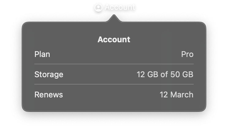
import nib


def main(app: nib.App):
    app.title = "Account"
    app.icon = nib.SFSymbol("person.crop.circle")
    app.height = 200

    def row(label, value):
        return nib.HStack(
            controls=[
                nib.Text(label),
                nib.Spacer(),
                nib.Text(value, foreground_color=nib.Color.SECONDARY),
            ]
        )

    app.build(
        nib.VStack(
            controls=[
                nib.Text("Account", font=nib.Font.HEADLINE),
                row("Plan", "Pro"),
                nib.Divider(),
                row("Storage", "12 GB of 50 GB"),
                nib.Divider(),
                row("Renews", "12 March"),
            ],
            spacing=8,
            padding=20,
            width=260,
        )
    )


nib.run(main)
Styled divider with color and spacing
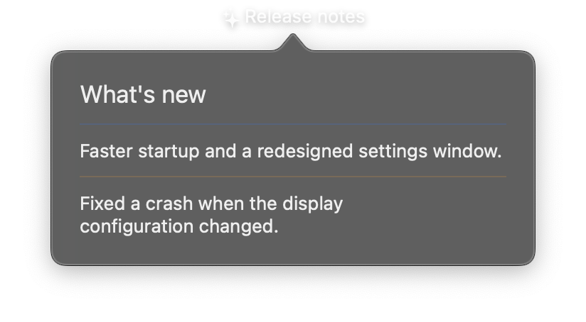
import nib


def main(app: nib.App):
    app.title = "Release notes"
    app.icon = nib.SFSymbol("sparkles")
    app.width = 340

    app.build(
        nib.VStack(
            controls=[
                nib.Text("What's new", font=nib.Font.TITLE2),
                nib.Divider(foreground_color=nib.Color.BLUE, padding={"vertical": 4}),
                nib.Text("Faster startup and a redesigned settings window."),
                nib.Divider(foreground_color=nib.Color.ORANGE, padding={"vertical": 4}),
                nib.Text("Fixed a crash when the display configuration changed."),
            ],
            spacing=6,
            padding=20,
            width=300,
            alignment=nib.Alignment.LEADING,
        )
    )


nib.run(main)