Context Menu
Nib supports two kinds of context menus:
- Status bar menu (
app.menu): appears when the user right-clicks the menu bar icon. Built withMenuItemandMenuDividerobjects. - View context menu (
context_menu=): appears when the user right-clicks any view in your app. Built with nib views likeButton,Toggle,Picker,Divider,Text, andShareLink.
Status Bar Menu
The status bar context menu appears when a user right-clicks (or Control-clicks) the menu bar icon. Set it with app.menu, passing a list of MenuItem and MenuDivider objects.
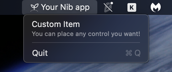
Basic Menu
import nib

def main(app: nib.App):
    app.title = "My App"
    app.icon = nib.SFSymbol("star.fill")
    app.width = 300
    app.height = 200

    def open_settings():
        print("Settings opened")

    app.menu = [
        nib.MenuItem("Settings", action=open_settings, icon="gear"),
        nib.MenuDivider(),
        nib.MenuItem("Quit", action=app.quit),
    ]

    app.build(nib.Text("Right-click the menu bar icon", padding=24))

nib.run(main)
Icons
Pass a string for a simple SF Symbol icon, or an SFSymbol instance for styled icons:
# Simple string icon
nib.MenuItem("Settings", action=handler, icon="gear")

# Styled icon with color
nib.MenuItem(
    "Favorites",
    action=handler,
    icon=nib.SFSymbol("star.fill", foreground_color=nib.Color.YELLOW),
)
Keyboard Shortcuts
Use the shortcut parameter with modifier keys joined by +:
nib.MenuItem("Settings", action=open_settings, shortcut="cmd+,")
nib.MenuItem("New Window", action=new_window, shortcut="cmd+n")
nib.MenuItem("Quit", action=app.quit, shortcut="cmd+q")
nib.MenuItem("Refresh", action=refresh, shortcut="cmd+shift+r")
nib.MenuItem("Toggle", action=toggle, shortcut="opt+t")
Supported modifiers: cmd, shift, opt (or alt), ctrl.
Badges
Badges display a small label on the right side of the menu item. They are useful for showing counts or status.
nib.MenuItem("Updates", action=check_updates, badge="3")
nib.MenuItem("Messages", action=open_messages, badge="New")
State Indicators
The state parameter shows a checkmark, no mark, or a mixed indicator:
nib.MenuItem("Enabled", action=toggle_feature, state="on")     # Checkmark
nib.MenuItem("Disabled", action=toggle_feature, state="off")    # No mark
nib.MenuItem("Partial", action=toggle_feature, state="mixed")   # Dash mark
A common pattern is to toggle the state dynamically:
feature_on = False

def toggle_feature():
    global feature_on
    feature_on = not feature_on
    rebuild_menu()

def rebuild_menu():
    app.menu = [
        nib.MenuItem(
            "Feature",
            action=toggle_feature,
            state="on" if feature_on else "off",
            icon="checkmark.circle",
        ),
        nib.MenuDivider(),
        nib.MenuItem("Quit", action=app.quit),
    ]
Disabled Items
Set enabled=False to gray out an item and prevent clicks:
nib.MenuItem("Unavailable", enabled=False)
nib.MenuItem("Premium Only", action=upgrade, enabled=is_premium)
Menu Dividers
MenuDivider draws a horizontal separator line between items:
app.menu = [
    nib.MenuItem("Action 1", action=handler1),
    nib.MenuItem("Action 2", action=handler2),
    nib.MenuDivider(),
    nib.MenuItem("Quit", action=app.quit),
]
Submenus
Nest menus by passing a menu list to a MenuItem:
nib.MenuItem(
    "Export",
    icon="square.and.arrow.up",
    menu=[
        nib.MenuItem("Export as PDF", action=export_pdf, icon="doc"),
        nib.MenuItem("Export as PNG", action=export_png, icon="photo"),
        nib.MenuItem("Export as CSV", action=export_csv, icon="tablecells"),
    ],
)
Submenus can be nested to any depth:
nib.MenuItem(
    "More",
    icon="ellipsis.circle",
    menu=[
        nib.MenuItem("Level 1", menu=[
            nib.MenuItem("Level 2 - A", action=handler_a),
            nib.MenuItem("Level 2 - B", action=handler_b),
        ]),
    ],
)
Custom View Content
For rich menu items, use the content parameter with any Nib view. When using content, the title and icon parameters are ignored.
nib.MenuItem(
    content=nib.HStack(
        controls=[
            nib.SFSymbol("star.fill", foreground_color=nib.Color.YELLOW),
            nib.VStack(
                controls=[
                    nib.Text("Premium", font=nib.Font.HEADLINE),
                    nib.Text("Upgrade now", font=nib.Font.CAPTION,
                              foreground_color=nib.Color.SECONDARY),
                ],
                alignment=nib.HorizontalAlignment.LEADING,
                spacing=2,
            ),
        ],
        spacing=8,
    ),
    action=upgrade,
    height=50,
)
Tip
Set the height parameter when using content to ensure the menu item has enough vertical space for your custom view.
View Context Menu
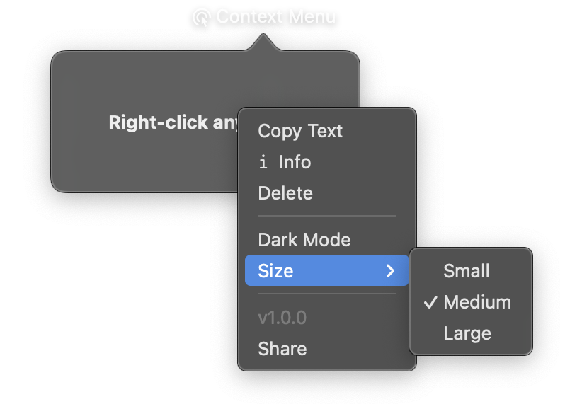
Any nib view supports a context_menu parameter. When set, right-clicking that view shows a native macOS context menu with the specified items. This uses SwiftUI's .contextMenu modifier under the hood.
Basic Usage
nib.Text(
    "Right-click me",
    context_menu=[
        nib.Button("Copy", action=copy_fn),
        nib.Button("Paste", action=paste_fn),
        nib.Divider(),
        nib.Button("Delete", action=delete_fn, role="destructive"),
    ],
    padding=20,
)
The context_menu parameter accepts a list of nib views. It works on any view. Text, VStack, Image, Button, etc.
Supported Menu Item Views
SwiftUI context menus support a specific set of views as menu items:
| View | Description |
|---|---|
Button |
Clickable action item. Supports role="destructive" for red delete-style items. |
Button with content= |
Custom button layout with icon + text using HStack. |
Divider |
Horizontal separator between groups of items. |
Toggle |
On/off switch inside the menu. |
Picker |
Inline selection from a list of options. |
Text |
Static, non-interactive label (e.g., version info). |
ShareLink |
Opens the native macOS share sheet. |
Note
Layout views like VStack, HStack, Image, and List are not rendered inside context menus. SwiftUI only supports menu-compatible views in the .contextMenu builder.
Button Variants
Buttons are the most common menu item. You can create plain buttons, icon buttons, and destructive buttons:
context_menu=[
    # Plain text button
    nib.Button("Copy", action=copy_fn),

    # Button with icon
    nib.Button(
        content=nib.HStack(
            controls=[nib.SFSymbol("doc.on.doc"), nib.Text("Duplicate")]
        ),
        action=duplicate_fn,
    ),

    # Destructive button (shown in red)
    nib.Button("Delete", action=delete_fn, role="destructive"),
]
Toggle and Picker
Interactive controls work inside context menus:
dark_mode = False

def toggle_dark(value):
    nonlocal dark_mode
    dark_mode = value

def on_pick(value):
    print(f"Selected: {value}")

context_menu=[
    nib.Toggle("Dark Mode", is_on=dark_mode, on_change=toggle_dark),
    nib.Picker(
        "Size",
        selection="Medium",
        options=["Small", "Medium", "Large"],
        on_change=on_pick,
    ),
]
Works on Any View
Since context_menu is a base View parameter, it works on containers, controls, shapes. Anything:
# On a container
nib.VStack(
    controls=[nib.Text("Content")],
    context_menu=[nib.Button("Refresh", action=refresh)],
    padding=16,
)

# On an image
nib.Image(
    "photo.jpg",
    context_menu=[
        nib.Button("Save", action=save),
        nib.Button("Copy", action=copy),
        nib.ShareLink(items=["photo.jpg"], label="Share"),
    ],
)
Related
- MenuItem and MenuDivider, App.menu
- SFSymbol: menu item icons
- Settings: settings window
- Hotkeys and Clipboard:
app.on_hotkey()