RectMark
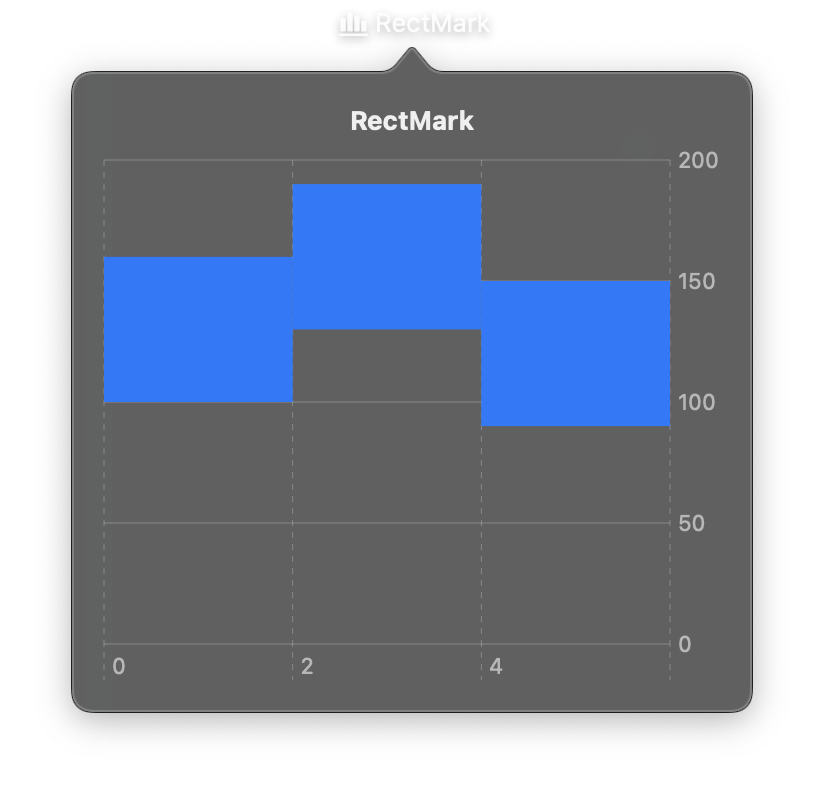
Draws filled rectangles defined by their bounds in data space. RectMark is ideal for heatmaps, Gantt charts, range visualizations, and other grid-based charts where each cell represents a data value.
Rectangles can be positioned using center points (x, y) for automatic sizing, or explicit bounds (x_start/x_end, y_start/y_end) for precise control.
RectMark is used inside a Chart container as one of the marks entries.
Constructor
nib.RectMark(
    x=None,
    x_start=None,
    x_end=None,
    y=None,
    y_start=None,
    y_end=None,
    foreground_style=None,
    corner_radius=None,
    opacity=None,
)
Parameters
| Parameter | Type | Default | Description |
|---|---|---|---|
x |
str | PlottableField |
None |
Data field for the x-axis center position. Used for categorical grids where cell width is determined automatically. |
x_start |
str | PlottableField |
None |
Data field for the left edge of the rectangle. |
x_end |
str | PlottableField |
None |
Data field for the right edge of the rectangle. |
y |
str | PlottableField |
None |
Data field for the y-axis center position. Used for categorical grids where cell height is determined automatically. |
y_start |
str | PlottableField |
None |
Data field for the bottom edge of the rectangle. |
y_end |
str | PlottableField |
None |
Data field for the top edge of the rectangle. |
foreground_style |
str | PlottableField |
None |
Fill color. Accepts hex strings, named colors, or a PlottableField to encode data values as colors (essential for heatmaps). |
corner_radius |
float |
None |
Radius for rounded corners in points. |
opacity |
float |
None |
Opacity from 0.0 to 1.0. |
Examples
Heatmap
import nib


def main(app: nib.App):
    app.title = "Activity"
    app.icon = nib.SFSymbol("square.grid.3x3.fill")
    app.width = 380
    app.height = 300

    levels = {
        "Mon": ["low", "high", "medium", "low"],
        "Tue": ["medium", "high", "high", "low"],
        "Wed": ["low", "medium", "high", "medium"],
        "Thu": ["high", "high", "medium", "low"],
        "Fri": ["medium", "low", "low", "low"],
    }
    hours = ["9am", "11am", "2pm", "4pm"]
    data = [
        {"weekday": day, "hour": hour, "intensity": level}
        for day, row in levels.items()
        for hour, level in zip(hours, row)
    ]

    app.build(
        nib.Chart(
            data=data,
            marks=[
                nib.RectMark(
                    x="weekday",
                    y="hour",
                    foreground_style=nib.PlottableField("intensity"),
                )
            ],
            legend=nib.ChartLegend(position="bottom"),
            width=340,
            height=240,
            padding=20,
        )
    )


nib.run(main)
Gantt chart (range chart)
import nib


def main(app: nib.App):
    app.title = "Plan"
    app.icon = nib.SFSymbol("calendar.badge.clock")
    app.width = 420
    app.height = 280

    tasks = [
        {"task": "Design", "start": 0, "end": 3, "status": "complete"},
        {"task": "Develop", "start": 2, "end": 7, "status": "in progress"},
        {"task": "Test", "start": 6, "end": 9, "status": "pending"},
        {"task": "Release", "start": 9, "end": 10, "status": "pending"},
    ]

    app.build(
        nib.Chart(
            data=tasks,
            marks=[
                nib.RectMark(
                    x_start="start",
                    x_end="end",
                    y="task",
                    foreground_style=nib.PlottableField("status"),
                    corner_radius=4,
                ),
            ],
            x_axis=nib.ChartAxis(label="Week"),
            legend=nib.ChartLegend(position="bottom"),
            width=380,
            height=220,
            padding=20,
        )
    )


nib.run(main)