ZStack
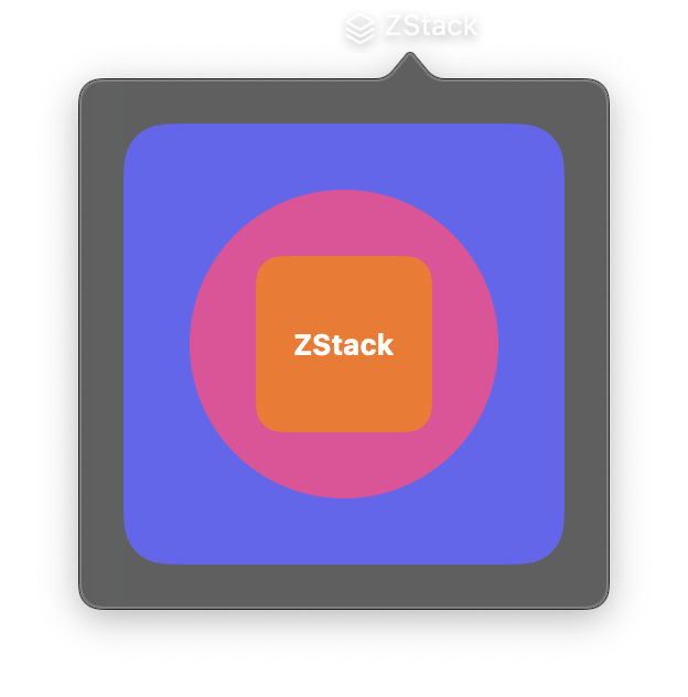
A layered stack layout that overlays its child views on top of each other along the z-axis. The first child in the controls list is rendered at the back (bottom layer), and each subsequent child is layered on top.
Unlike VStack and HStack which arrange children sequentially, ZStack allows children to occupy the same space. This is useful for creating backgrounds, overlays, badges, and complex layered UI elements.
Constructor
nib.ZStack(
    controls=None,
    alignment=None,
    **modifiers,
)
Parameters
| Parameter | Type | Default | Description |
|---|---|---|---|
controls |
list[View] |
None |
Child views to layer on top of each other. The first view is at the back, subsequent views are layered on top. |
alignment |
Alignment | str |
None |
Two-dimensional alignment of children within the stack. Options: Alignment.CENTER, Alignment.TOP, Alignment.BOTTOM, Alignment.LEADING, Alignment.TRAILING, Alignment.TOP_LEADING, Alignment.TOP_TRAILING, Alignment.BOTTOM_LEADING, Alignment.BOTTOM_TRAILING. Defaults to center. |
**modifiers |
Common view modifiers: padding, background, foreground_color, opacity, width, height, on_hover, on_click, etc. |
Mutable Properties
| Property | Type | Description |
|---|---|---|
controls |
list[View] |
Get or set the child views. Setting triggers a UI update. |
Examples
Card with background
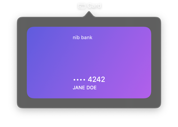
import nib


def main(app: nib.App):
    app.title = "Card"
    app.icon = nib.SFSymbol("creditcard")

    app.build(
        nib.ZStack(
            controls=[
                nib.Rectangle(
                    corner_radius=14,
                    fill=nib.LinearGradient(
                        colors=["#5e5ce6", "#bf5af2"], start=(0, 0), end=(1, 1)
                    ),
                ),
                nib.VStack(
                    controls=[
                        nib.Text(
                            "nib bank",
                            font=nib.Font.CAPTION,
                            foreground_color=nib.Color.WHITE.with_opacity(0.8),
                        ),
                        nib.Spacer(),
                        nib.Text(
                            "•••• 4242",
                            font=nib.Font.TITLE3,
                            foreground_color=nib.Color.WHITE,
                        ),
                        nib.Text(
                            "JANE DOE",
                            font=nib.Font.CAPTION,
                            foreground_color=nib.Color.WHITE,
                        ),
                    ],
                    alignment=nib.Alignment.LEADING,
                    padding=16,
                ),
            ],
            width=260,
            height=150,
            padding=20,
        )
    )


nib.run(main)
Badge overlay
Position a notification badge in the top-trailing corner of an icon.
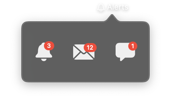
import nib


def main(app: nib.App):
    app.title = "Alerts"
    app.icon = nib.SFSymbol("bell")

    def badge(icon, count):
        return nib.ZStack(
            controls=[
                nib.SFSymbol(icon, font=nib.Font.system(30)),
                nib.Text(
                    str(count),
                    font=nib.Font.CAPTION2,
                    foreground_color=nib.Color.WHITE,
                    padding={"horizontal": 5, "vertical": 1},
                    background=nib.Capsule(fill=nib.Color.RED),
                ),
            ],
            alignment=nib.Alignment.TOP_TRAILING,
        )

    app.build(
        nib.HStack(
            controls=[
                badge("bell.fill", 3),
                badge("envelope.fill", 12),
                badge("bubble.left.fill", 1),
            ],
            spacing=28,
            padding=20,
        )
    )


nib.run(main)