MenuItem & MenuDivider
Classes for building the right-click context menu on the status bar icon. MenuItem represents a clickable entry with optional icons, shortcuts, submenus, and custom view content. MenuDivider inserts a horizontal separator line between items.
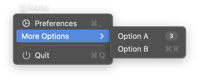
import nib


def main(app: nib.App):
    app.title = "Menu"
    app.icon = nib.SFSymbol("contextualmenu.and.cursorarrow")
    app.width = 300
    app.height = 150

    app.menu = [
        nib.MenuItem("Preferences", icon="gear", shortcut="cmd+,"),
        nib.MenuItem(
            "More Options",
            menu=[
                nib.MenuItem("Option A", badge="3"),
                nib.MenuItem("Option B", shortcut="cmd+R"),
            ],
        ),
        nib.MenuDivider(),
        nib.MenuItem(
            "Quit",
            icon="power",
            shortcut="cmd+Q",
            action=app.quit,
        ),
    ]

    app.build(
        nib.VStack(
            controls=[
                nib.Text("Right-click the status bar icon", font=nib.Font.HEADLINE),
                nib.Text(
                    "to see the context menu.",
                    font=nib.Font.CAPTION,
                    foreground_color=nib.Color.SECONDARY,
                ),
            ],
            spacing=4,
            padding=20,
        )
    )


nib.run(main)
MenuItem
Constructor
nib.MenuItem(
    title=None,
    action=None,
    icon=None,
    content=None,
    menu=None,
    shortcut=None,
    state=None,
    badge=None,
    enabled=True,
    height=None,
)
Parameters
| Parameter | Type | Default | Description |
|---|---|---|---|
title |
str | None |
None |
The menu item text. Optional if content is provided |
action |
Callable[[], None] | None |
None |
Callback invoked when the item is clicked |
icon |
str | SFSymbol | None |
None |
SF Symbol name as a string (e.g. "gear") or an SFSymbol instance with full configuration |
content |
View | None |
None |
Custom view for rich menu item content. Replaces title and icon when provided |
menu |
list[MenuItem] | None |
None |
Child items to create a submenu |
shortcut |
str | None |
None |
Keyboard shortcut displayed next to the item, e.g. "cmd+q", "cmd+shift+n", "opt+x" |
state |
str | None |
None |
Checkmark state indicator. "on" shows a checkmark, "off" shows nothing, "mixed" shows a dash |
badge |
str | None |
None |
Badge text shown on the right side of the item (macOS 14+) |
enabled |
bool |
True |
Whether the item is clickable. Disabled items appear grayed out |
height |
float | None |
None |
Custom height in points for content-based items. Default is auto-sized |
Properties
All constructor parameters are stored as public instance attributes and can be read directly:
| Property | Type | Description |
|---|---|---|
title |
str | None |
The menu item text |
action |
Callable | None |
Click callback |
icon |
str | SFSymbol | None |
Icon configuration |
content |
View | None |
Custom view content |
menu |
list[MenuItem] |
Submenu items (empty list if none) |
shortcut |
str | None |
Keyboard shortcut string |
state |
str | None |
Checkmark state |
badge |
str | None |
Badge text |
enabled |
bool |
Whether the item is enabled |
height |
float | None |
Custom height |
MenuDivider
A horizontal separator line between menu items. Takes no parameters.
Constructor
nib.MenuDivider()
Examples
Basic context menu
import nib

def main(app: nib.App):
    app.title = "My App"
    app.icon = nib.SFSymbol("star.fill")
    app.width = 300
    app.height = 200

    def open_settings():
        print("Opening settings")

    app.menu = [
        nib.MenuItem("Settings", action=open_settings, icon="gear", shortcut="cmd+,"),
        nib.MenuDivider(),
        nib.MenuItem("Quit", action=app.quit, shortcut="cmd+q"),
    ]

    app.build(nib.Text("Right-click the menu bar icon", padding=20))

nib.run(main)
Submenus and state indicators
import nib

def main(app: nib.App):
    app.title = "Editor"
    app.icon = nib.SFSymbol("doc.text")
    app.width = 300
    app.height = 200

    current_theme = "light"

    def set_theme(name):
        nonlocal current_theme
        current_theme = name
        print(f"Theme set to {name}")

    app.menu = [
        nib.MenuItem(
            "Theme",
            icon="paintbrush",
            menu=[
                nib.MenuItem(
                    "Light",
                    action=lambda: set_theme("light"),
                    state="on" if current_theme == "light" else "off",
                ),
                nib.MenuItem(
                    "Dark",
                    action=lambda: set_theme("dark"),
                    state="on" if current_theme == "dark" else "off",
                ),
            ],
        ),
        nib.MenuItem("Export", icon="square.and.arrow.up", badge="New"),
        nib.MenuItem("Disabled Item", enabled=False),
        nib.MenuDivider(),
        nib.MenuItem("Quit", action=app.quit),
    ]

    app.build(nib.Text("Right-click for menu", padding=20))

nib.run(main)
Related
- App: Set the menu via
app.menu - SFSymbol: Used for menu item icons
- Context Menu: menu guide