Picker
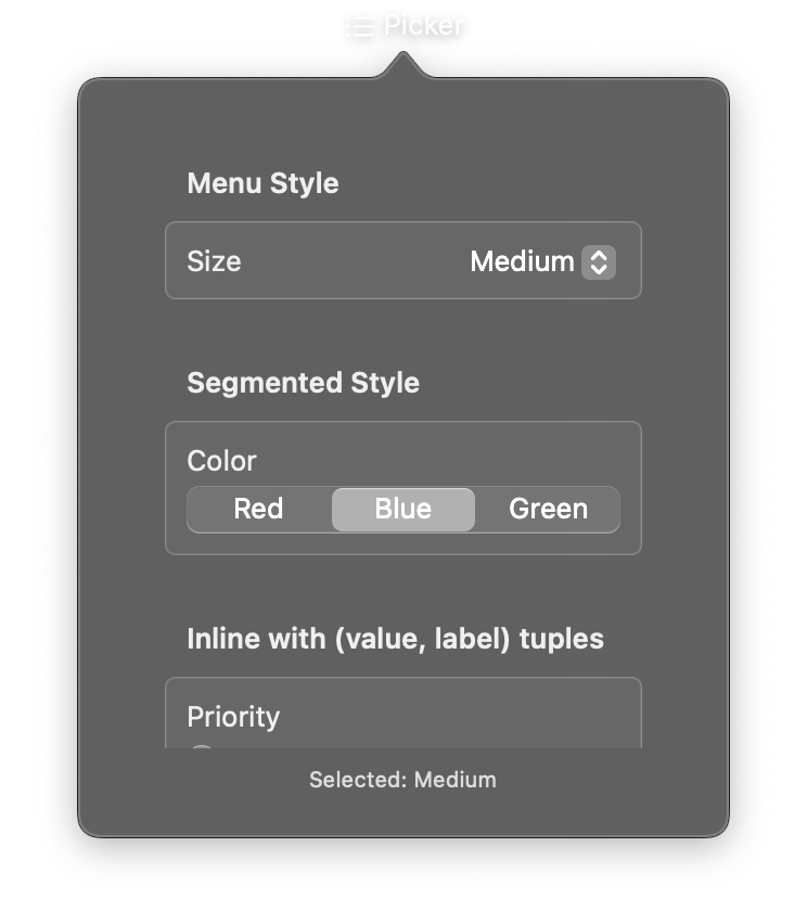
A selection control for choosing one option from a predefined set. The picker supports simple string options or (value, label) tuples for cases where internal values differ from display text. Multiple visual styles are available, including dropdown menus, segmented controls, and wheels.
Constructor
nib.Picker(
    label="",
    selection="",
    options=None,
    on_change=None,
    style=None,
    disabled=False,
    **modifiers,
)
Parameters
| Parameter | Type | Default | Description |
|---|---|---|---|
label |
str |
"" |
Descriptive label for the picker. Displayed above or beside the options depending on the style. |
selection |
str |
"" |
Currently selected option value. Must match one of the values in the options list. |
options |
list[str] | list[tuple[str, str]] |
None |
Available options. Can be a list of strings (value equals label) or a list of (value, label) tuples for separate internal values and display text. |
on_change |
Callable[[str], None] |
None |
Callback called when the selection changes. Receives the newly selected value as a string. |
style |
PickerStyle | str |
None |
Visual style. Options: PickerStyle.automatic, PickerStyle.menu, PickerStyle.segmented, PickerStyle.wheel, PickerStyle.inline. |
disabled |
bool |
False |
Whether the picker is disabled and non-interactive. |
**modifiers |
Common view modifiers: padding, background, foreground_color, opacity, etc. |
Mutable Properties
| Property | Type | Description |
|---|---|---|
selection |
str |
Get or set the currently selected value. |
options |
list |
Get or set the list of available options. |
on_change |
Callable |
Get or set the selection change callback. |
Examples
Dropdown menu picker
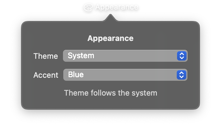
import nib


def main(app: nib.App):
    app.title = "Appearance"
    app.icon = nib.SFSymbol("paintpalette")

    preview = nib.Text("Theme follows the system", foreground_color=nib.Color.SECONDARY)

    def choose(theme):
        preview.content = f"Theme: {theme}"

    app.build(
        nib.VStack(
            controls=[
                nib.Text("Appearance", font=nib.Font.HEADLINE),
                nib.Picker(
                    "Theme",
                    selection="System",
                    options=["System", "Light", "Dark"],
                    on_change=choose,
                ),
                nib.Picker(
                    "Accent",
                    selection="Blue",
                    options=["Blue", "Purple", "Pink", "Orange", "Green"],
                ),
                preview,
            ],
            spacing=12,
            padding=20,
            width=260,
        )
    )


nib.run(main)
Segmented control
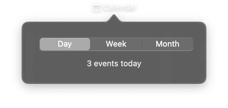
import nib


def main(app: nib.App):
    app.title = "Calendar"
    app.icon = nib.SFSymbol("calendar")

    summary = nib.Text("3 events today")

    def switch_view(mode):
        summary.content = {
            "Day": "3 events today",
            "Week": "11 events this week",
            "Month": "40 events this month",
        }[mode]

    app.build(
        nib.VStack(
            controls=[
                nib.Picker(
                    "",
                    selection="Day",
                    options=["Day", "Week", "Month"],
                    on_change=switch_view,
                    style=nib.PickerStyle.SEGMENTED,
                ),
                summary,
            ],
            spacing=12,
            padding=20,
            width=260,
        )
    )


nib.run(main)
Related
- Toggle
- Style Enums:
PickerStyle - Form
- Settings