VisualEffectBlur
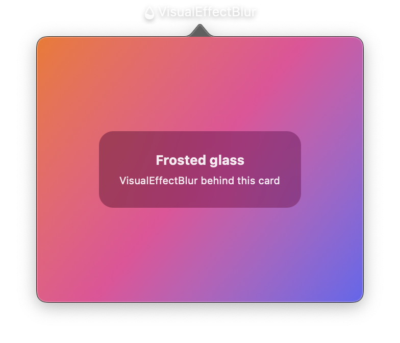
A view that applies a macOS frosted-glass blur effect, wrapping NSVisualEffectView. It creates the translucent blur commonly seen in menu bar apps, sidebars, and other system UI. Can be used as a standalone view or as a background for other views.
All properties are reactive. Updating them triggers an immediate UI refresh.
Constructor
nib.VisualEffectBlur(
    material=BlurStyle.POPOVER,
    blending_mode=BlurBlendingMode.BEHIND_WINDOW,
    is_emphasized=False,
    corner_radius=None,
    **modifiers,
)
Parameters
| Parameter | Type | Default | Description |
|---|---|---|---|
material |
BlurStyle |
BlurStyle.POPOVER |
The blur material/style. Controls the visual appearance and vibrancy level. See the BlurStyle table below. |
blending_mode |
BlurBlendingMode |
BlurBlendingMode.BEHIND_WINDOW |
How the blur blends with content. BEHIND_WINDOW blurs content behind the window; WITHIN_WINDOW blurs content within the same window. |
is_emphasized |
bool |
False |
Whether to use the emphasized appearance, which increases vibrancy. |
corner_radius |
float |
None |
Corner radius for a rounded blur region. |
**modifiers |
Common view modifiers: width, height, padding, opacity, etc. |
Mutable Properties
| Property | Type | Description |
|---|---|---|
material |
BlurStyle |
Get or set the blur material. Setting triggers a UI update. |
blending_mode |
BlurBlendingMode |
Get or set the blending mode. |
is_emphasized |
bool |
Get or set the emphasized state. |
corner_radius |
float | None |
Get or set the corner radius. |
BlurStyle
The BlurStyle enum maps to NSVisualEffectView.Material values on macOS.
Standard materials
| Value | Description |
|---|---|
HEADER_VIEW |
Header region style. |
TOOLTIP |
Tooltip popup style. |
MENU |
Menu background style. |
POPOVER |
Popover background style. Default. |
SIDEBAR |
Sidebar panel style. |
FULLSCREEN_UI |
Full-screen overlay style. |
HUD |
Heads-up display style. |
SHEET |
Sheet overlay style. |
WINDOW_BACKGROUND |
Window background style. |
CONTENT_BACKGROUND |
Content area background. |
UNDER_WINDOW_BACKGROUND |
Under-window background. |
UNDER_PAGE_BACKGROUND |
Under-page background. |
Vibrancy
| Value | Description |
|---|---|
TITLEBAR |
Title bar vibrancy. |
SELECTION |
Selection highlight vibrancy. |
System materials
| Value | Description |
|---|---|
ULTRA_THIN |
Ultra-thin blur. Most transparent. |
THIN |
Thin blur. |
REGULAR |
Regular blur. |
THICK |
Thick blur. |
ULTRA_THICK |
Ultra-thick blur. Most opaque. |
BlurBlendingMode
| Value | Description |
|---|---|
BEHIND_WINDOW |
Blurs content behind the entire window. |
WITHIN_WINDOW |
Blurs content within the same window, behind this view. |
Examples
As a view background
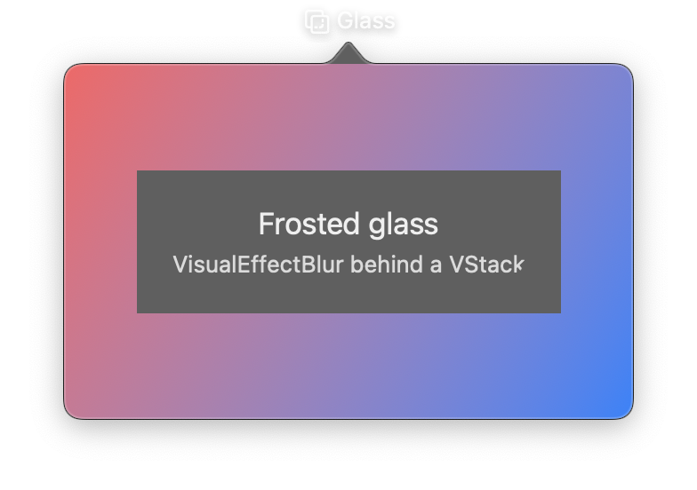
import nib


def main(app: nib.App):
    app.title = "Glass"
    app.icon = nib.SFSymbol("square.on.square.intersection.dashed")
    app.width = 320
    app.height = 200

    app.build(
        nib.ZStack(
            controls=[
                nib.LinearGradient(
                    colors=["#ff5e62", "#0a84ff"],
                    start=(0, 0),
                    end=(1, 1),
                    width=320,
                    height=200,
                ),
                nib.VStack(
                    controls=[
                        nib.Text("Frosted glass", font=nib.Font.TITLE2),
                        nib.Text(
                            "VisualEffectBlur behind a VStack",
                            foreground_color=nib.Color.SECONDARY,
                        ),
                    ],
                    spacing=4,
                    padding=20,
                    background=nib.VisualEffectBlur(material=nib.BlurStyle.POPOVER),
                    corner_radius=12,
                ),
            ]
        )
    )


nib.run(main)
Menu-style blur with rounded corners
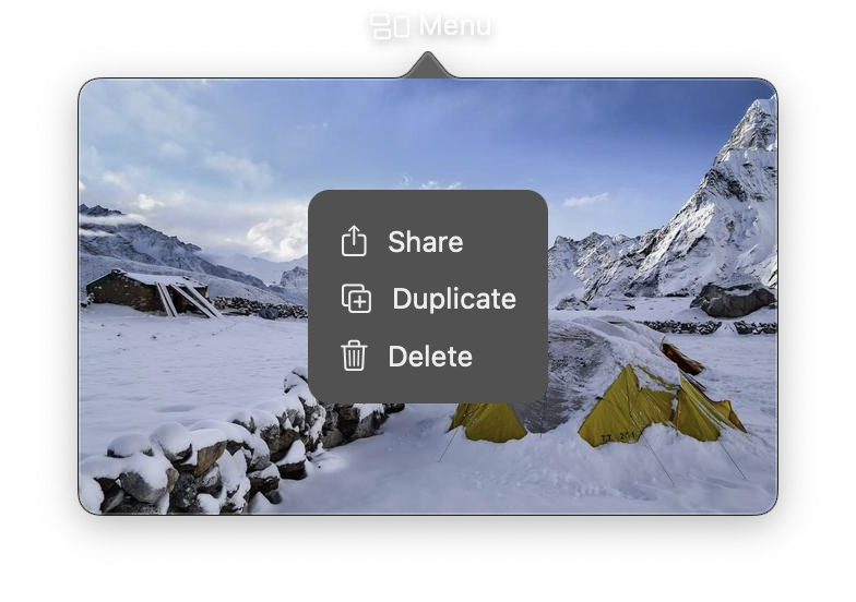
import nib


def main(app: nib.App):
    app.title = "Menu"
    app.icon = nib.SFSymbol("rectangle.3.group")
    app.width = 320
    app.height = 200

    app.build(
        nib.ZStack(
            controls=[
                nib.Image(
                    src="https://picsum.photos/id/1036/640/400",
                    aspect_ratio=nib.ContentMode.FILL,
                    width=320,
                    height=200,
                ),
                nib.VStack(
                    controls=[
                        nib.Label("Share", icon="square.and.arrow.up"),
                        nib.Label("Duplicate", icon="plus.square.on.square"),
                        nib.Label("Delete", icon="trash"),
                    ],
                    spacing=10,
                    padding=14,
                    alignment=nib.Alignment.LEADING,
                    background=nib.VisualEffectBlur(
                        material=nib.BlurStyle.MENU, corner_radius=10
                    ),
                ),
            ]
        )
    )


nib.run(main)