SectorMark
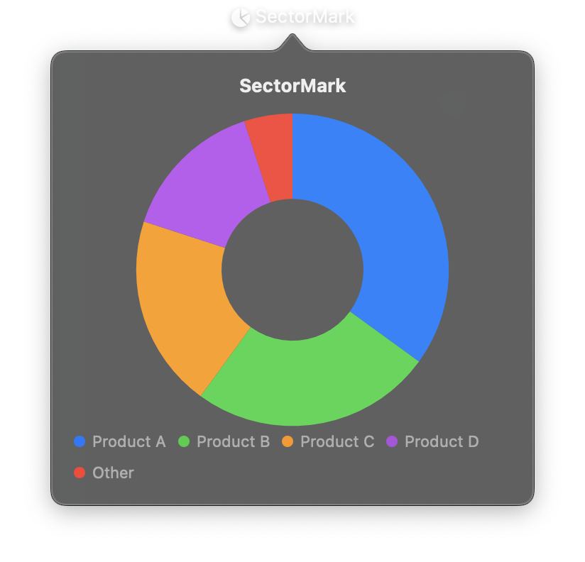
Creates circular segments (wedges) based on angular data, suited for pie and donut charts showing proportional relationships and part-to-whole comparisons. Setting inner_radius to a value greater than zero creates a donut chart instead of a pie chart.
The angle field determines the size of each sector proportionally. Use foreground_style with a PlottableField to automatically assign colors to each category.
SectorMark is used inside a Chart container as one of the marks entries.
Constructor
nib.SectorMark(
    angle,
    foreground_style=None,
    inner_radius=None,
    outer_radius=None,
    angle_start=None,
    corner_radius=None,
    opacity=None,
)
Parameters
| Parameter | Type | Default | Description |
|---|---|---|---|
angle |
str | PlottableField |
required | Data field containing values that determine sector sizes. Values are treated proportionally: a sector with value 20 is twice as large as one with value 10. |
foreground_style |
str | PlottableField |
None |
Fill color for sectors. Use a PlottableField with a categorical field to automatically assign different colors to each sector. |
inner_radius |
float |
None |
Inner radius in points. Set to 0 (or omit) for a pie chart. Set to a positive value for a donut chart. |
outer_radius |
float |
None |
Outer radius in points. Defaults to automatic sizing based on available space. |
angle_start |
str | PlottableField |
None |
Data field or value for the starting angle of sectors. Rarely needed; use for custom sector positioning. |
corner_radius |
float |
None |
Radius for rounded sector corners in points. Creates a softer visual appearance. |
opacity |
float |
None |
Opacity from 0.0 to 1.0. |
Examples
Pie chart
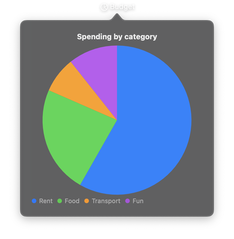
import nib


def main(app: nib.App):
    app.title = "Budget"
    app.icon = nib.SFSymbol("chart.pie")
    app.width = 340
    app.height = 360

    app.build(
        nib.VStack(
            controls=[
                nib.Text("Spending by category", font=nib.Font.HEADLINE),
                nib.Chart(
                    data=[
                        {"category": "Rent", "value": 1200},
                        {"category": "Food", "value": 480},
                        {"category": "Transport", "value": 160},
                        {"category": "Fun", "value": 220},
                    ],
                    marks=[
                        nib.SectorMark(
                            angle="value",
                            foreground_style=nib.PlottableField("category"),
                        )
                    ],
                    legend=nib.ChartLegend(position="bottom"),
                    width=300,
                    height=280,
                ),
            ],
            spacing=8,
            padding=20,
        )
    )


nib.run(main)
Donut chart
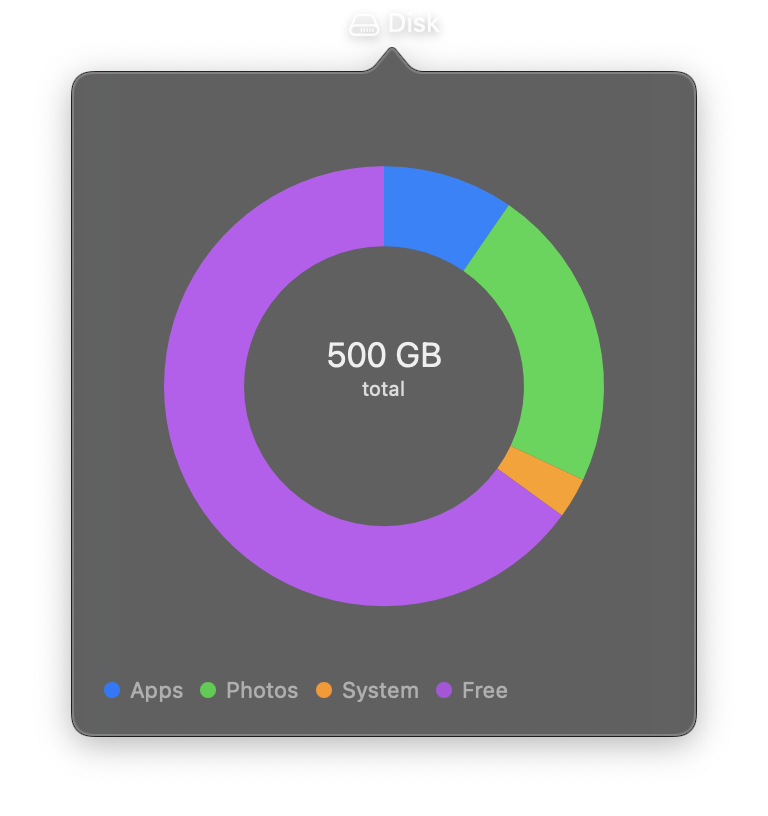
import nib


def main(app: nib.App):
    app.title = "Disk"
    app.icon = nib.SFSymbol("internaldrive")
    app.width = 320
    app.height = 340

    app.build(
        nib.ZStack(
            controls=[
                nib.Chart(
                    data=[
                        {"segment": "Apps", "gb": 48},
                        {"segment": "Photos", "gb": 112},
                        {"segment": "System", "gb": 15},
                        {"segment": "Free", "gb": 325},
                    ],
                    marks=[
                        nib.SectorMark(
                            angle="gb",
                            foreground_style=nib.PlottableField("segment"),
                            inner_radius=70,
                            outer_radius=110,
                        ),
                    ],
                    legend=nib.ChartLegend(position="bottom"),
                    width=280,
                    height=300,
                ),
                nib.VStack(
                    controls=[
                        nib.Text("500 GB", font=nib.Font.TITLE2),
                        nib.Text(
                            "total",
                            font=nib.Font.CAPTION,
                            foreground_color=nib.Color.SECONDARY,
                        ),
                    ],
                    spacing=0,
                    padding={"bottom": 36},
                ),
            ],
            padding=16,
        )
    )


nib.run(main)