Section
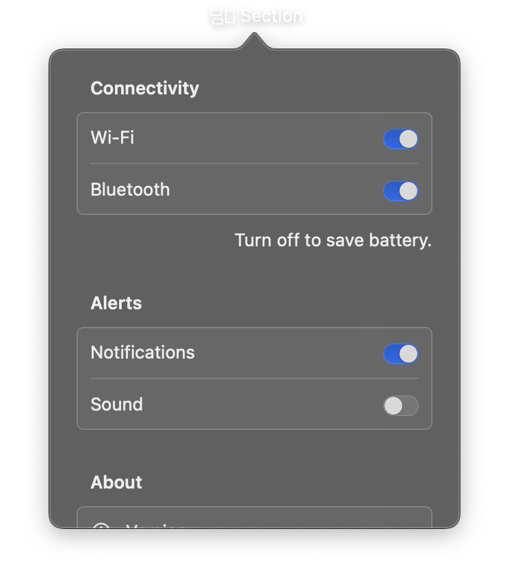
A container for grouping related content with optional header and footer text. Section is designed to be used within a List or Form to organize content into logical groups.
The header typically describes the section's purpose, while the footer provides additional context, explanations, or disclaimers.
Constructor
nib.Section(
    controls=None,
    header=None,
    footer=None,
    **modifiers,
)
Parameters
| Parameter | Type | Default | Description |
|---|---|---|---|
controls |
list[View] |
None |
Child views to display within the section, rendered between the header and footer. |
header |
str |
None |
Text displayed above the section content. Rendered in a secondary text style. |
footer |
str |
None |
Text displayed below the section content. Rendered in a smaller, secondary text style. |
**modifiers |
Common view modifiers: padding, background, foreground_color, opacity, width, height, etc. |
Examples
Section with header
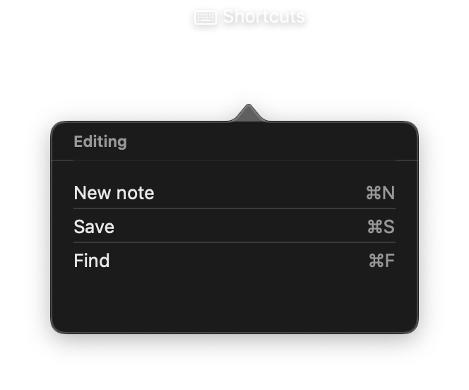
import nib


def main(app: nib.App):
    app.title = "Shortcuts"
    app.icon = nib.SFSymbol("keyboard")
    app.width = 280
    app.height = 200

    def shortcut(name, keys):
        return nib.HStack(
            controls=[
                nib.Text(name),
                nib.Spacer(),
                nib.Text(keys, foreground_color=nib.Color.SECONDARY),
            ]
        )

    app.build(
        nib.List(
            controls=[
                nib.Section(
                    controls=[
                        shortcut("New note", "⌘N"),
                        shortcut("Save", "⌘S"),
                        shortcut("Find", "⌘F"),
                    ],
                    header="Editing",
                ),
            ],
            height=150,
            width=260,
        )
    )


nib.run(main)
Section with header and footer
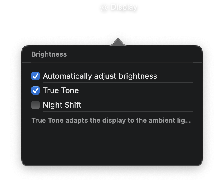
import nib


def main(app: nib.App):
    app.title = "Display"
    app.icon = nib.SFSymbol("sun.max")
    app.width = 320
    app.height = 240

    app.build(
        nib.List(
            controls=[
                nib.Section(
                    controls=[
                        nib.Toggle("Automatically adjust brightness", is_on=True),
                        nib.Toggle("True Tone", is_on=True),
                        nib.Toggle("Night Shift", is_on=False),
                    ],
                    header="Brightness",
                    footer="True Tone adapts the display to the ambient light.",
                ),
            ],
            height=200,
            width=300,
        )
    )


nib.run(main)